Charts
While comparison columns are a good way to check the size of the change, if you want to observe trends, you want to see them on the chart. Charts allow you to observe fluctuations of various metrics over time. With the addition of the previous time range, you can compare two time ranges with each other on one chart.
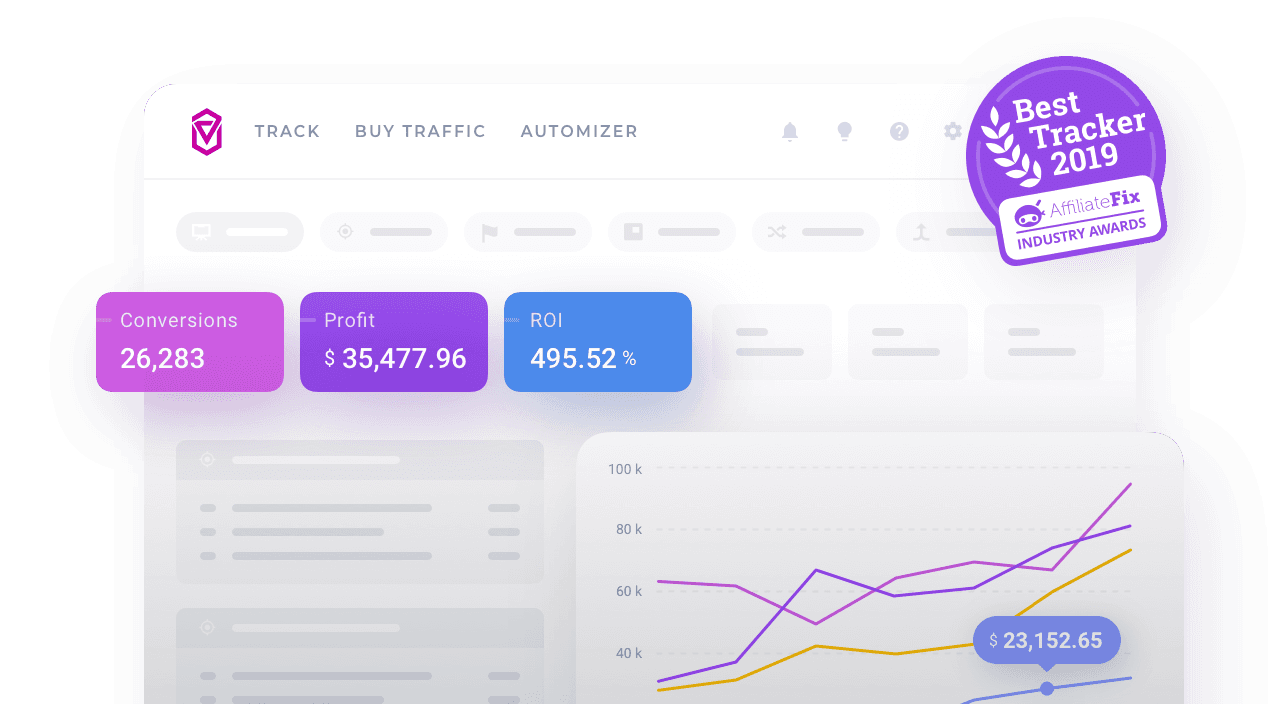
Charts show you the following metrics:
|
|
|
Turning on charts
You can turn on chart view at any time by clicking the Chart button.

Turning on previous time range
In order to turn on the previous time range on a chart, perform the following steps:
- In Voluum, click the Chart button, that is available in any view apart from the Dashboard view.
- Click the calendar to set your current time range, either custom or fixed one.
- Turn on the Previous time range toggle.

Data for the previous time range is presented on the chart with a dotted line.
Alternatively, you can enable the Display chart toggle in calendar when choosing time ranges to compare: